The Sweet Spot Campaign
Brand Identity Design
Capabilities: Concept Development, Communication, Branding, Logo Animation, Logo Design, Media Planning, Merchandise Design, Strategy, Typography
Toolkit: Adobe AfterEffects | Adobe Illustrator | Adobe Photoshop | Canva | Midjourney
Responsibilities: Campaign visual identity ideation and execution
Team: Bailey Germain (Business Leadership), Grayson DiBernado (Media Planning), Haley Cogan (Strategy), Jayna Shah (Studio Design), Muskan Dharani (Copywriting), Nevaeh Bhagat (Project Management)
Coaches: Aliyah Brown, Balay Woodworth, Kara Redcay, Lauren Barnett, Mackenzie Lane, Zena Hanna
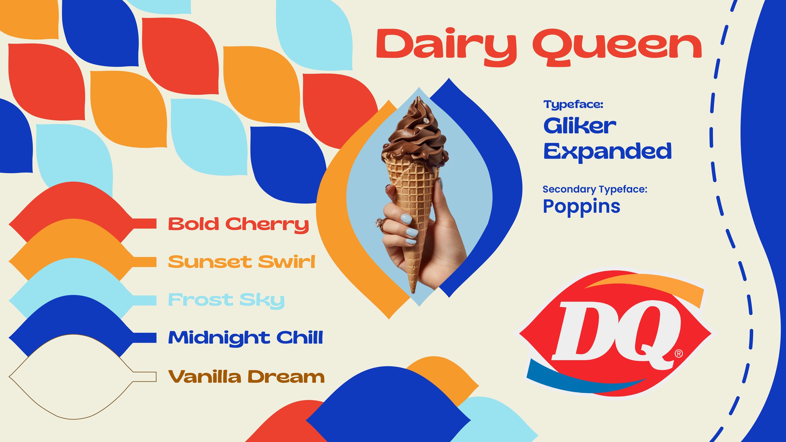
As part of the summer 2024 22Squared internship, a group of interns were tasked with reviving a struggling brand and make it ‘Impossible to Ignore’.
Probelm: Dairy Queen needs to increase its relevancy among Gen Z in order to secure their longevity for the future.
What If: DQ bridged the gap between Gen Z and Boomers through their love of sweet treats?
Manifesto: What’s a Sweet Spot?
The compromise of what you will watch today, just so you can spend time with a loved one?
Or the laughter after a joke, that took several minutes just to be understood?
Is it the keenness in learning about their interests, just so you can keep the conversation going?
Maybe, its the delight of sharing a sundae or two, because not deciding on the flavor is the easiest thing to do?
Or the learning of grandparent’s stories and the grandchildren’s dreams, that helps bridge the gap in between?
Or is it finding the common ground in all you do, just so you can build a bond that is strong and true?
A Sweet Spot let us tell you, is all these moments.
It’s a heart’s meeting place. The stomach’s happy place.
It’s where generations find their place.
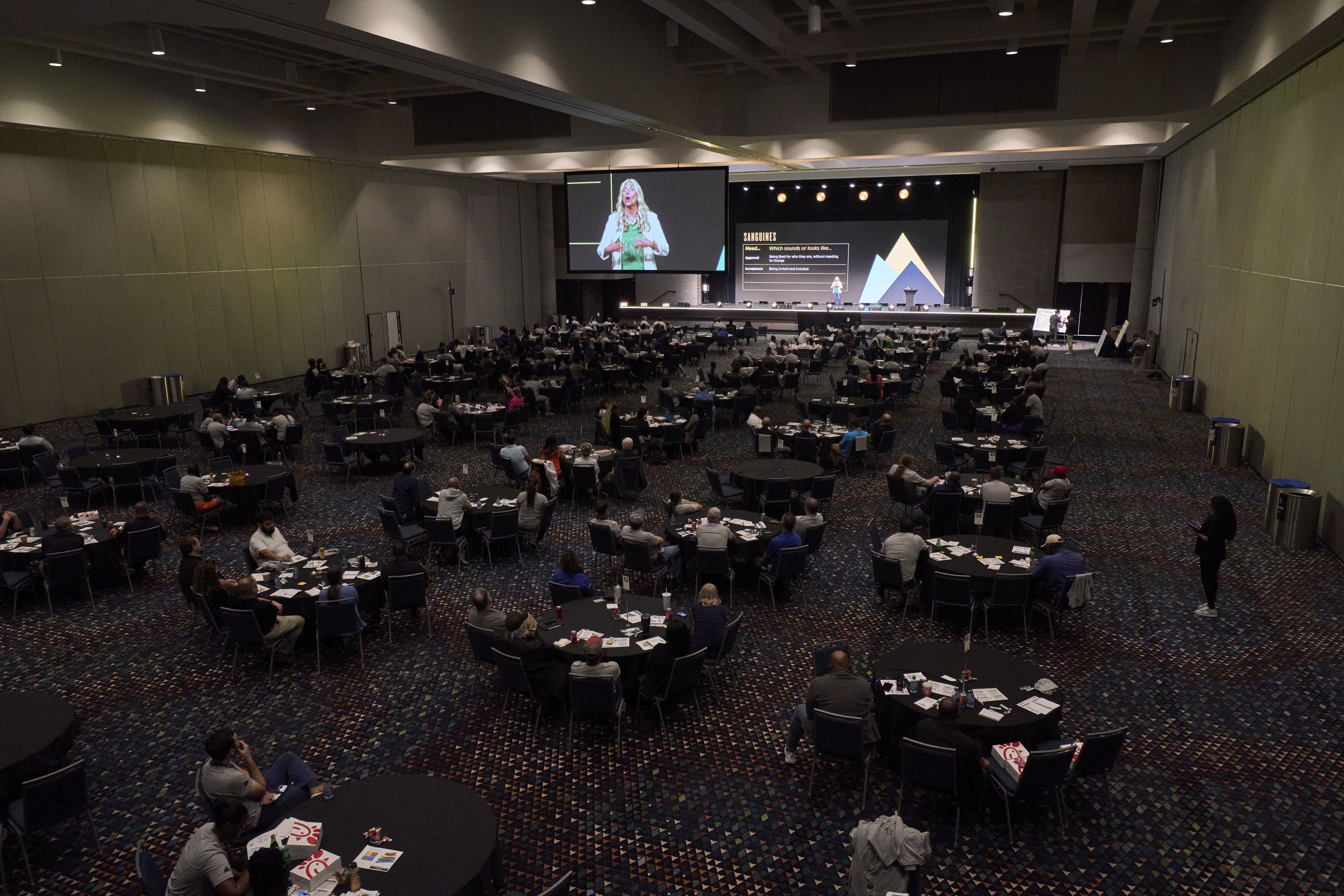
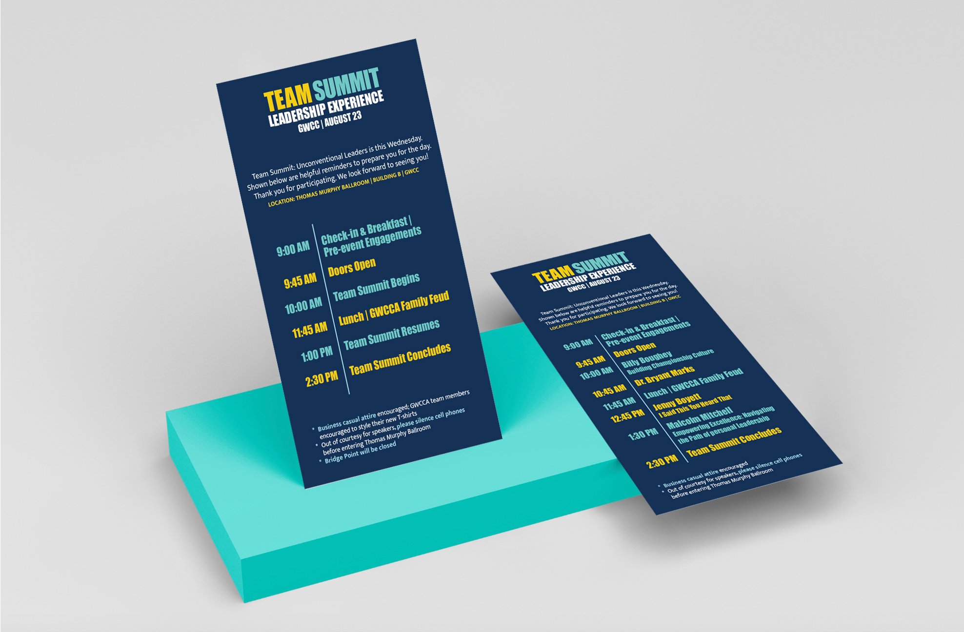
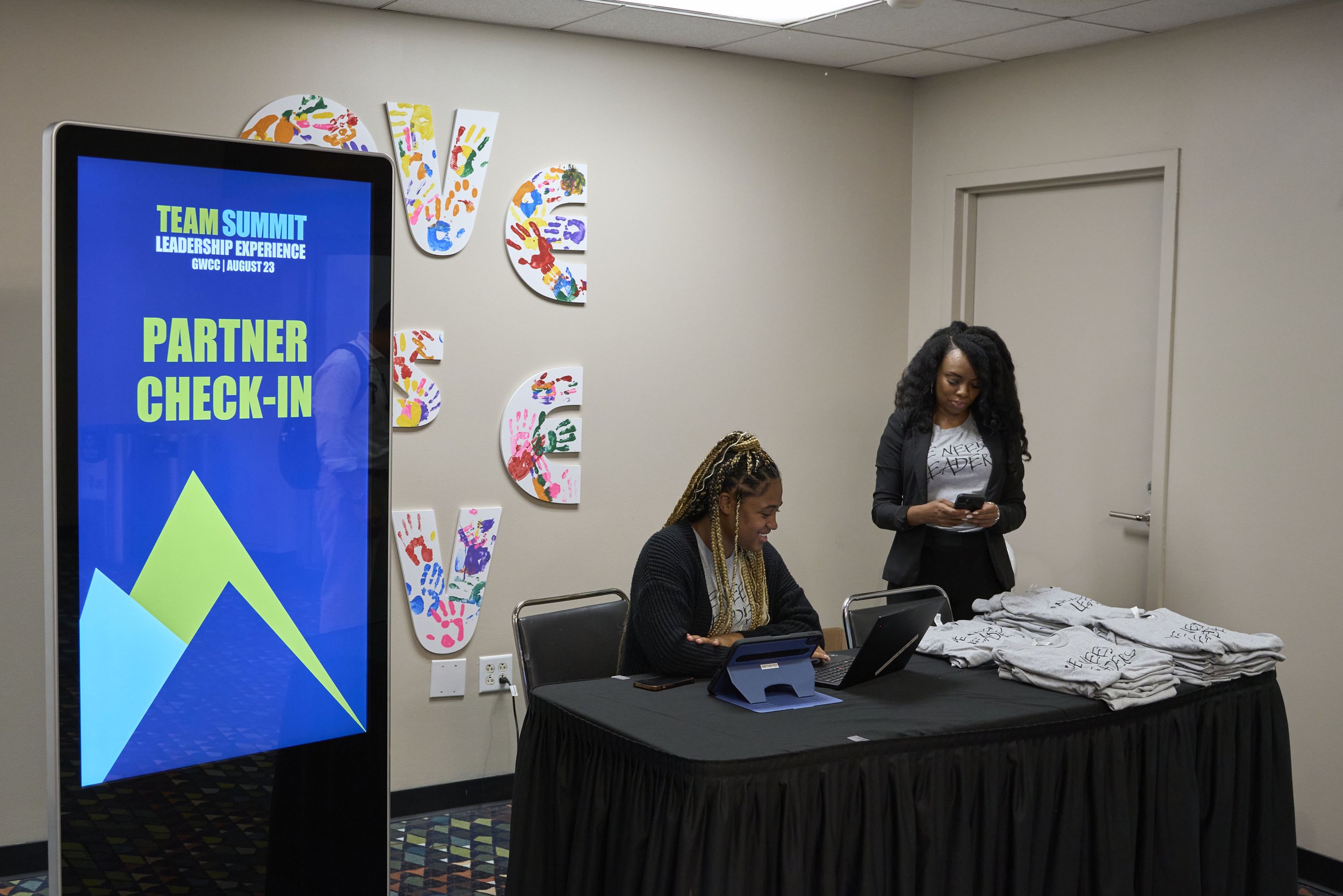
The extended visual identity system seamlessly integrates a variety of touchpoints, including email announcements and signage screens in GWCCA, keeping employees informed about speakers. "Know Before You Go" materials were distributed to both GWCCA team members and external stakeholders who were present during the experience.
Banners and signage were strategically placed at registration counters where event T-shirts were distributed. This cohesive approach ensured a consistent and impactful brand presence across various channels and mediums.
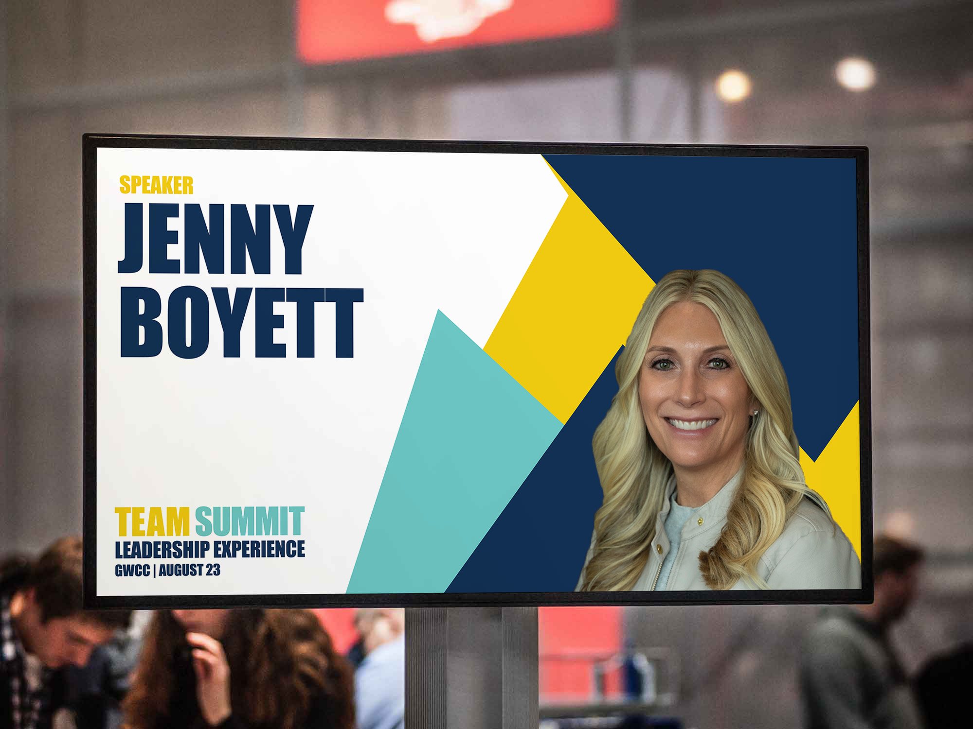

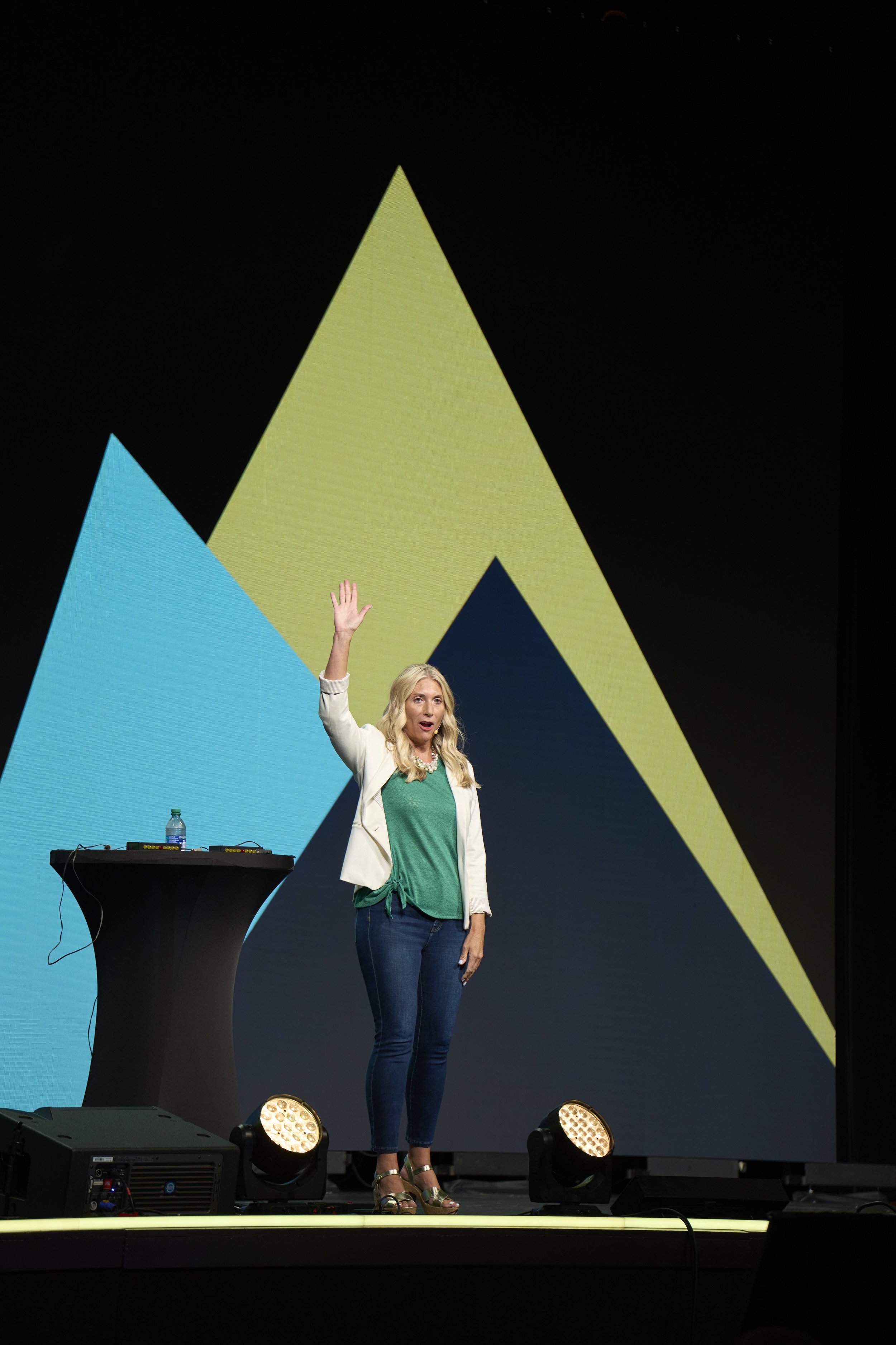
In addition to designing touchpoints, the slide deck was crafted with careful consideration for the ballroom's space, lighting, and size. The mountains from the logo were scaled and strategically placed on the right side of the screen, allowing speakers, who predominantly delivered speeches from that area, ample space on the left for presenting their content. This layout ensured a harmonious presentation, emphasizing the message and reinforcing the branding without any visual distractions.