Greenwise Rebrand
Brand Identity Design
Capabilities: Branding, Concept Development, Communication, Logo Animation, Mockups, Packaging, Prototyping, Typography
Toolkit: Adobe Illustrator | Adobe Photoshop | Adobe AfterEffects
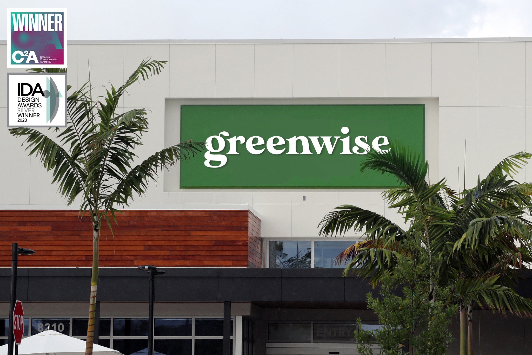
Winner of the Creative Communication Award (C2A) - Branding & Brand Identity, 2023.
Winner of the International Design Awards (IDA) Silver in Multimedia - Brand Identity, 2023.
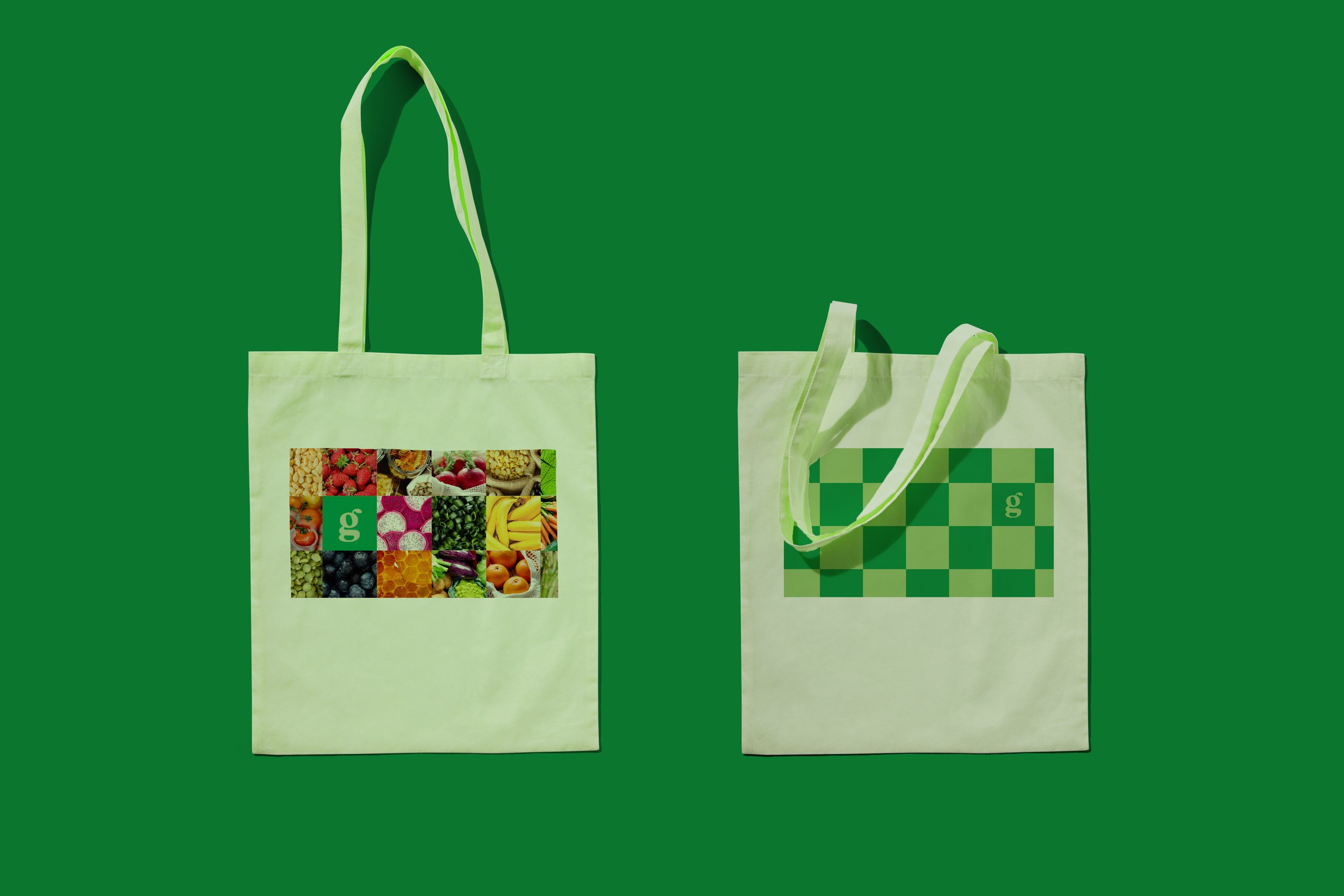
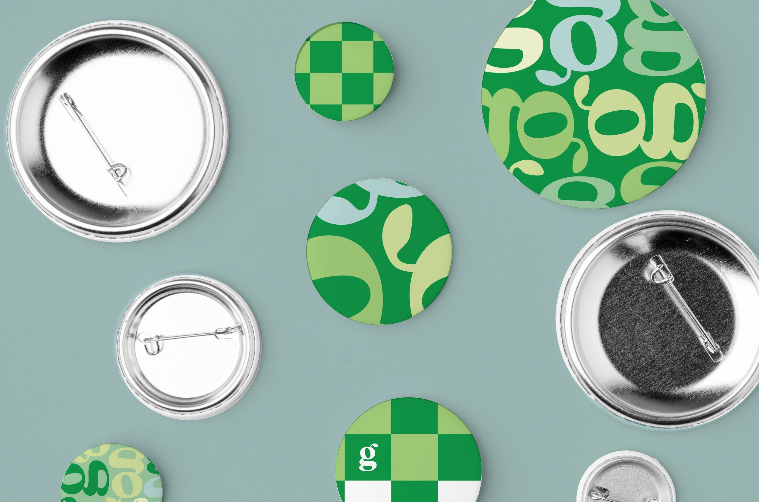
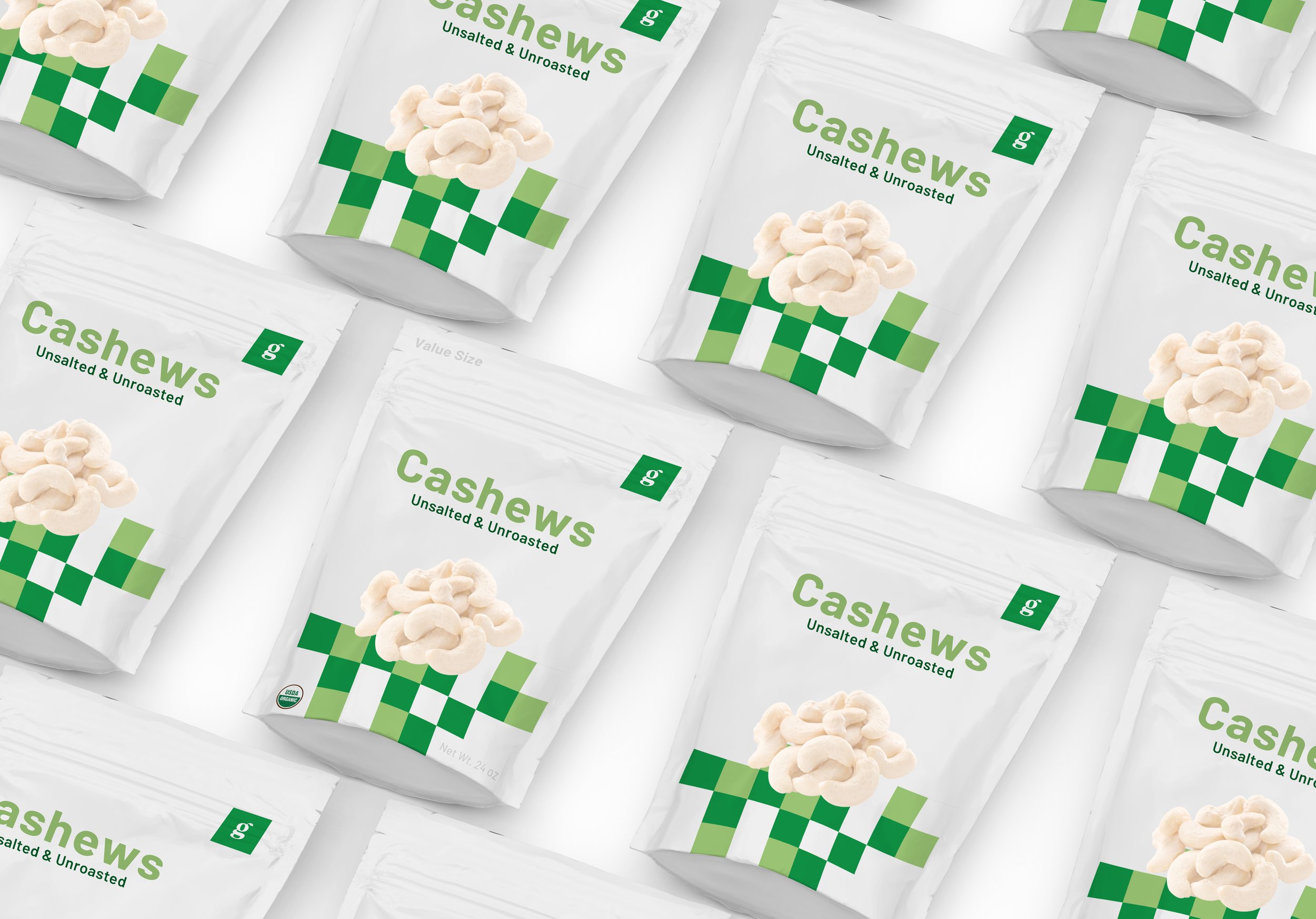
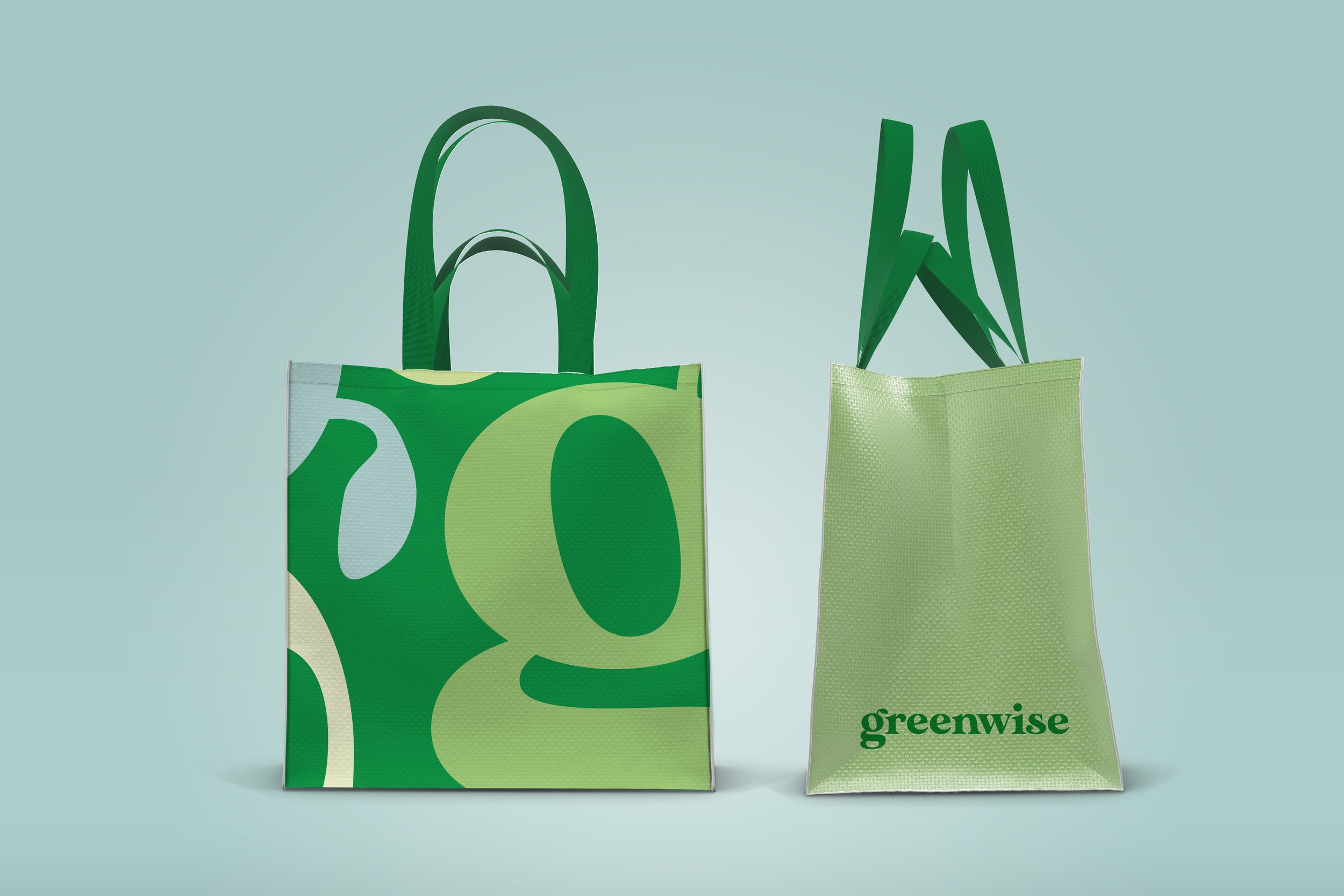
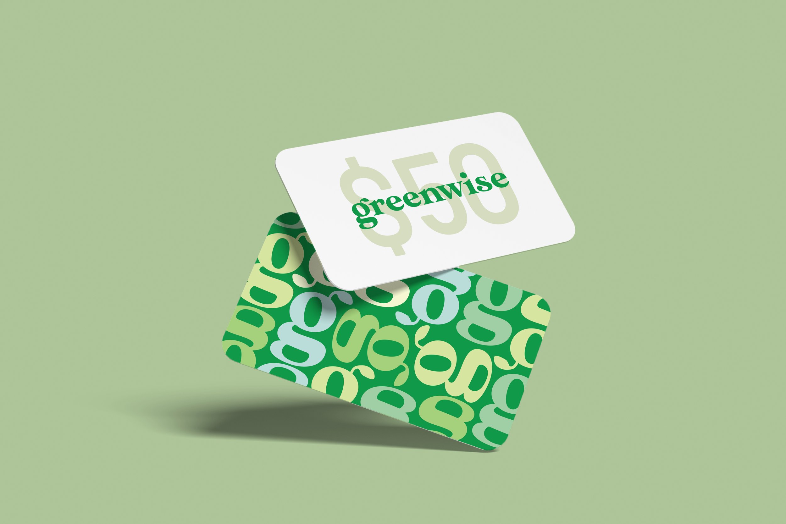
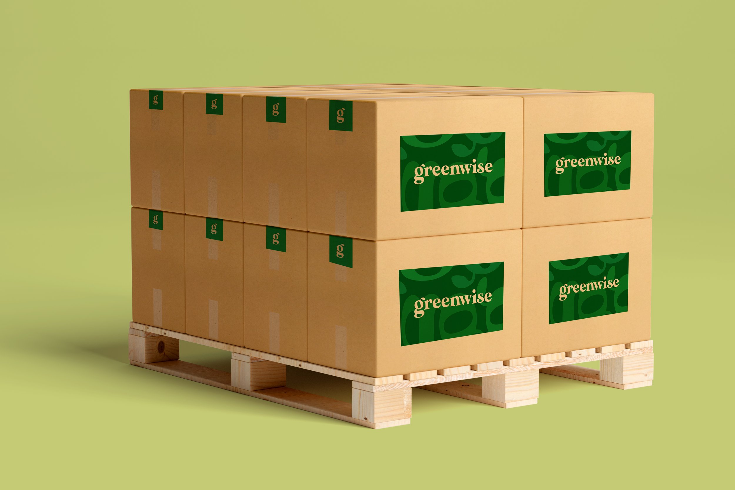
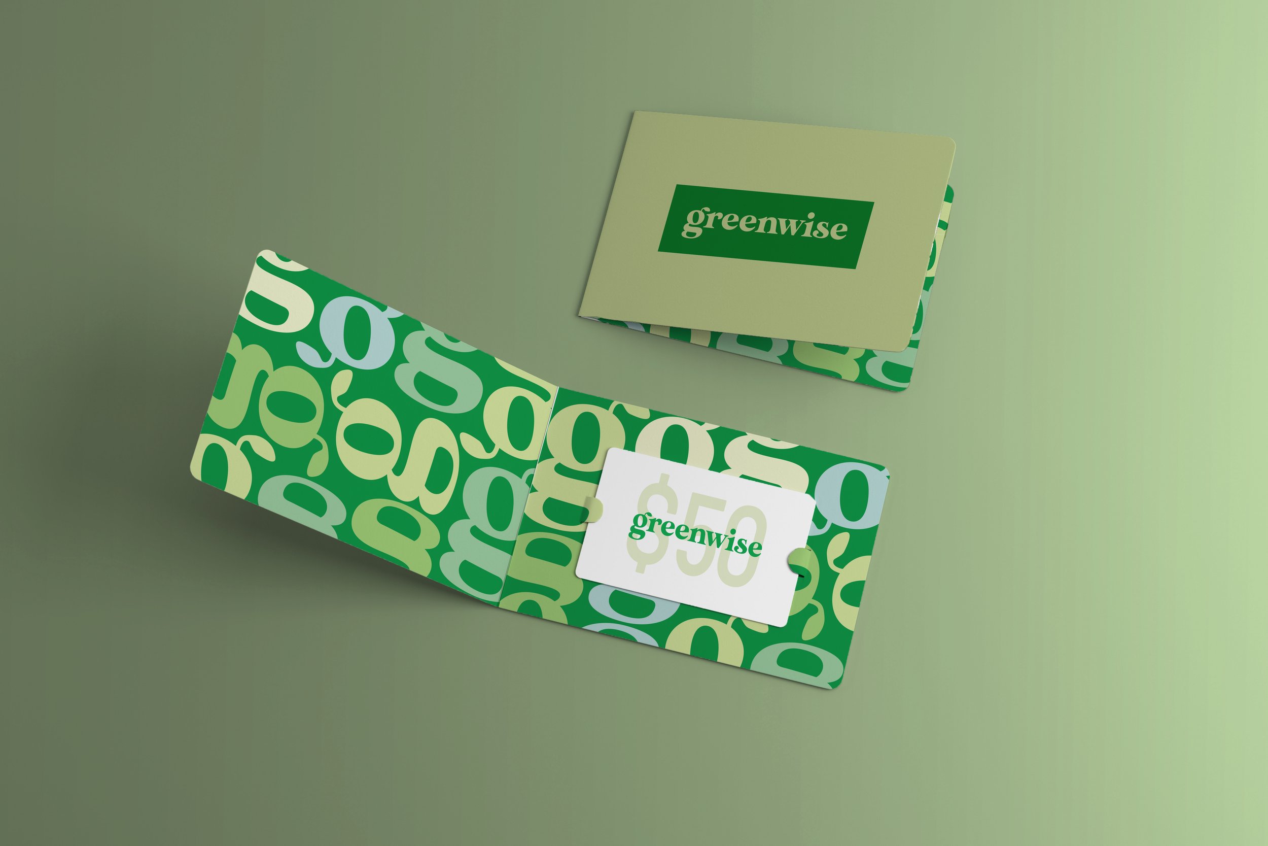
A refreshed identity system for the organic grocery chain provider, Greenwise by Publix located in the United States. The new brand direction centers around the concept of a square. A captivating repeat pattern of squares is created to foster exploration and inspire diverse interpretations, connecting the farm-to-table. This innovative approach combines illustrations and photography to create a harmonious visual experience.
For the logotype, I selected a typeface that embodies the organic essence of Greenwise. I made adjustments to the kerning and counters of the 'e' to give it a leaf-like appearance while softening the serifs to reflect the delicacy of a leaf. These alterations ensured that the logotype effectively conveyed the brand's natural and eco-friendly attributes.
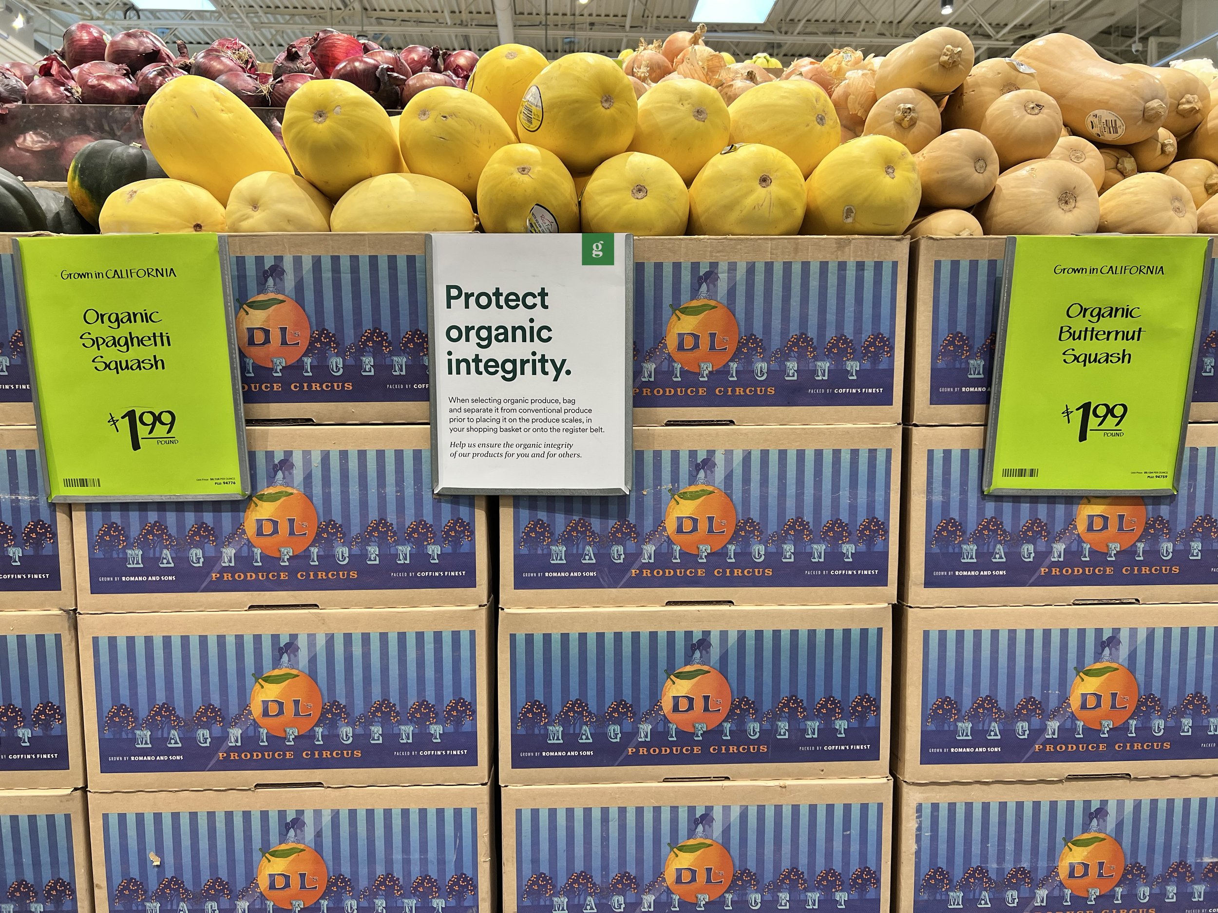


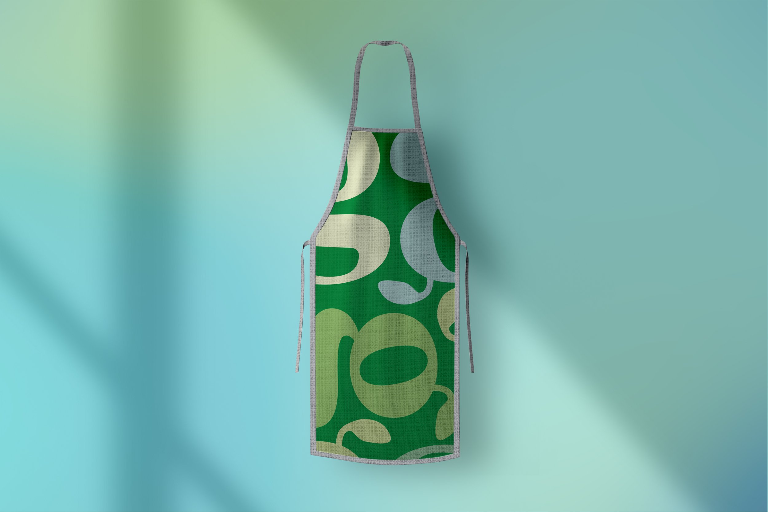
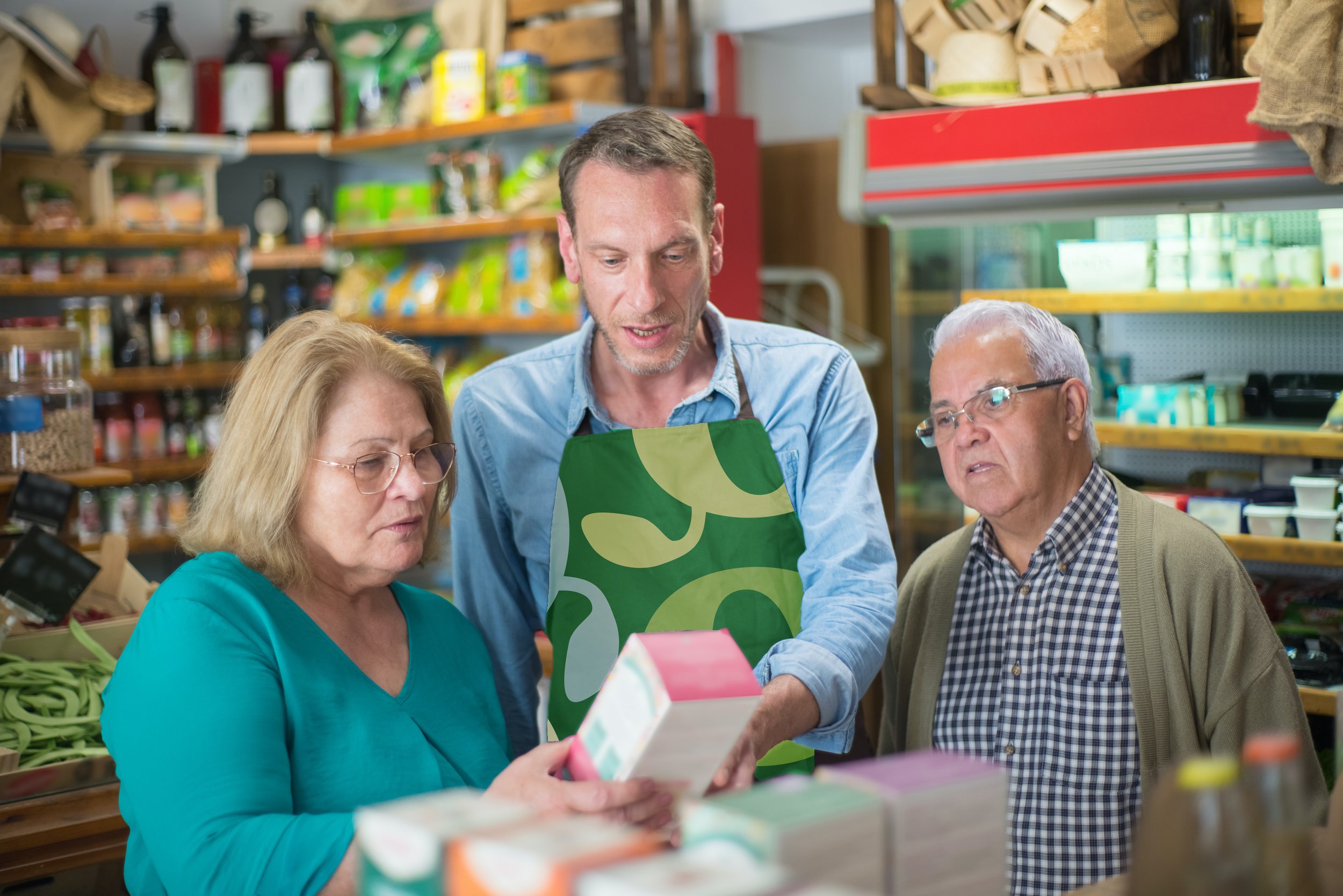

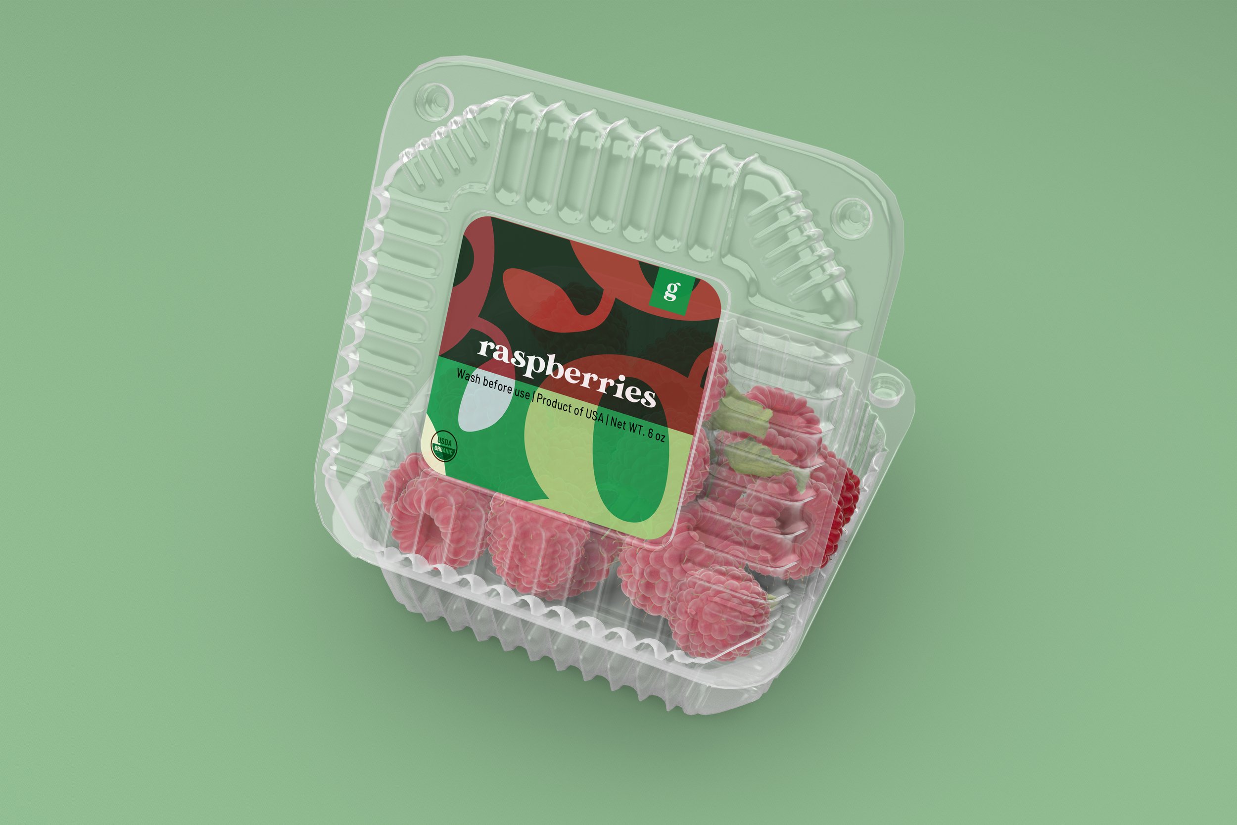
The organic color palette utilised throughout the rebrand reinforces Greenwise's core values of growth, energy, and well-being. Every touchpoint was thoughtfully considered during the process, ensuring a cohesive framework that extends from the store signage and the shopping experience to the delivery of goods.


The short animation expands on the concept of squares, symbolizing the farm-to-table journey. Utilizing a square as a framing device, the animation highlights photography that authentically portrays the brand's image.